Why is Facebook so Blue in Color?
This is original design of Facebook when it was called thefacebook.com – you were required to have an .edu email address to even open an account on Facebook.
This is Facebook now – open for all and 500 million people are using it already.
Why is Facebook Blue?
Facebook has gone through some major redesigns in the past few years but one part that has more or less stayed the same in all those years is the site’s blue color.
Everything is so blue about Facebook right from the sign-up page to the logo, their mobile app and even the site pop-ups that have shades of blue. Why?
I was recently listening to an episode of Twig where host Leo Laporte pointed to this New Yorker story on Mark Zuckerberg that seems to explain why Facebook is all blue in color.
The young Facebook founder is color blind but can see blue:
“Colors don’t matter much to Zuckerberg; a few years ago, he took an online test and realized that he was red-green color-blind. Blue is Facebook’s dominant color, because, as he said, “blue is the richest color for me – I can see all of blue.
Blue – The Web’s favorite color
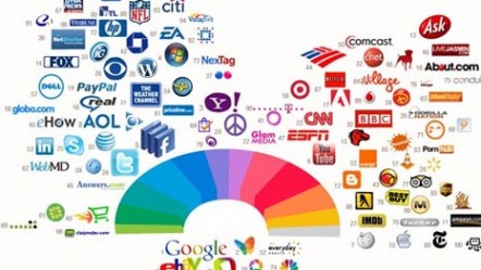
Facebook is not the only Internet brand the loves blue. An interesting study by Color Lovers has revealed that blue is the most popular and dominant color among the top 100 sites in the world followed by the red color.
Update: Emil Kostov sends this note on why Facebook maybe sticking with blue:
“It is part of their well planned Marketing plan. Most colors distract and make the human eye focus on them while blue act as a transparent palette for 65% of time spending watching the main background aka index space. It is well known also that blue color is the nirvana for the brain, as well green. Well, their choice make the competition envy most of the time.
Source:Labnol.org
Related Posts :
You are probably connected with multiple sets of people on Facebook that have little in common. ...
Logos are either purely graphical or are composed of the name of the organization.We created in ...
Here i am posting another brilliant designer Jerome Ebzant's work today . Here more about Jer ...
Your Gmail Inbox is overflowing with email messages. Some are newsletters that you are subscribe ...
If you come on a blog with a specific emotion, you may like it best if it caters you with the a ...
Posted on Tuesday, September 28th, 2010 at 4:29 am | Category: Articles |
Make a Donation
Magazine of the week
Categories
- Adobe Photoshop Tutorials
- Ajax
- Articles
- Companies
- Corporate / Elegant
- CSS
- Designers Work
- Flash
- Fonts
- Freebies
- Freelance / Portfolios
- Galleries
- Graphic Art
- HTML
- HTML5
- Icons
- Identity
- Illustration
- Internet
- Java Script
- Jquery
- Magazines
- Marketing
- One Page Websites
- Photo Creativity
- Photoshop
- Print Design
- Stock Images
- Typography
- Vectors
- Video Tutorials
- Wordpress
- Wordpress Themes


