Of all the cool elegant features in CSS, negative margins is the coolest of them all. Almost everyone is doing it for their web projects and it is absolutely fantastic. Just to set a few things right before we begin, margins are the spaces on the outside of an element while padding is the space inside the element(see CSS box model). It is important that you understand the difference between these two in order to avoid further trouble down the road.
Usage
A div with negative margin on the left looks like this:
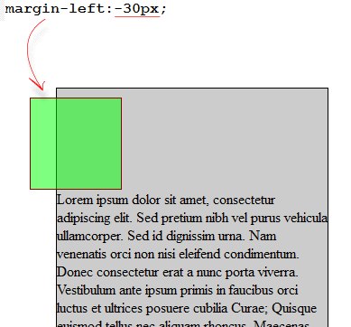
Code:
|
1 2 3 |
div.child{ margin-left:-30px; } |
A Few Facts about Negative Margins
A few things to note about them is that for one, they are valid CSS meaning that even the world wide web consortium agrees that you can use negative margins. They are not any kind of hack or workaround that web designers use so you should be comfortable using it. It is also easy on the flow of the web page and does not break it in any way even if you are not using floats.
They are also compatible across all modern browsers including Internet explorer so you do not have to worry about how the page will look on different browsers if you use negative margins.
When you apply floats to your elements, the negative margins will react differently so you should be careful when using them. When doing your designs in Dreamweaver, the negative margins will not show up in the design view so you should always open the page in a web browser in order to see the changes.
How to Work With Negative Margins
Negative margins can be used in very creative ways.
1. Margin Left or Margin Top
When margin-left or margin-top is applied, the elements shift in that direction. The negative margin pulls the element in the direction in which it has been placed. It will tend to pull the content upwards or towards the left.
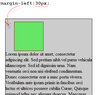
margin-left:30px;

margin-left:-30px;
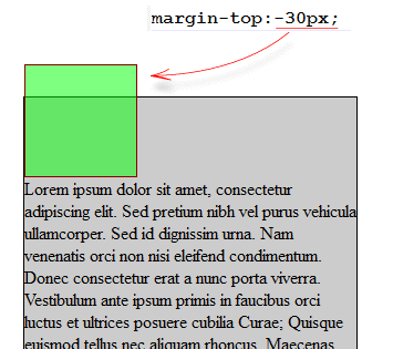
margin-top:-30px;
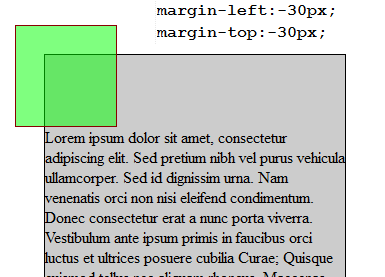
margin-left:-30px; margin-top:-30px;
2. Margin right or Margin Bottom
If you apply a negative margin opposite a float, a void is created leading to the content overlapping. This is quite helpful in liquid layouts where one column has a definite width while the other one has a width in terms of a percentage.
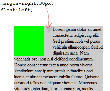
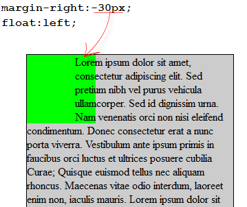
Creative Usage Scenarios
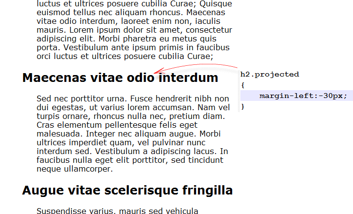
You can also overlap elements on purpose for added emphasis. This is done in order to make headings stand out and pull the attention of the user. In other cases, you can use the negative margins to have a simple yet elegant sidebar on your web page for displaying additional content in a beautiful manner.

Know what’s even cooler than using margins to position blocks? Using the freaking position rules that are *intended* to position blocks! What can you do with negative margins that you couldn’t do with position: relative? Next you’re gonna tell us to set font size using transform: scale()!